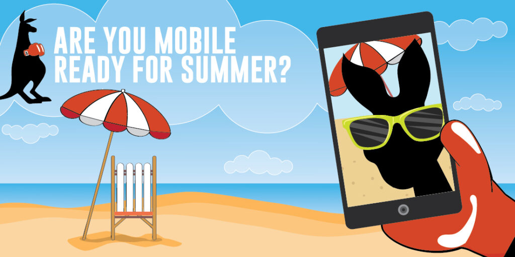
Summer is in full swing which means now more than ever people are ditching their desktops and using their smartphones to connect, shop and find what they need. Mobile used to be “the future of business”, but now it’s the norm! And people on the go need to find your business and info fast and easily. So does your site make the cut when it comes to phones and tablets?
Your ‘Make it Mobile’ Summertime checklist
- Updating your Hours of operation
During the summer people are looking for businesses and services “near me” more and more. They’re traveling and needing things on the fly, so If your address and locations aren’t up to date then you could be left out! Make sure your hours are accurate on all listings and if you’ve got different hours for Summer update those pronto.
- Summer Specials! The Summer is a perfect time to introduce yourself to new customers as well as woo folks with deals that make sense to summertime needs. People are on the lookout for big sales so keep your business at the top of their mind by having holiday relevant sales for the 4th, when people are looking to get outdoors and celebrate or Labor Day, when people get back to business.
- Navigation
When you pull up your site on a mobile device is it super easy to scroll through and find the links to what you need? Consider putting your navigation at the top of the page or at least make sure the links are clear, apparent and easy to read.When you pull up your site on a mobile device is it super easy to scroll through and find the links to what you need? Consider putting your navigation at the top of the page or at least make sure the links are clear, apparent and easy to read.
- SEO
There was a time when having a mobile site and a desktop friendly site was a good strategy for being ‘mobile friendly.’ The biggest problem with this method is that will mess with your google search big time. Instead just make sure your already existing website is mobile friendly. Then, all the hard work you’ve put in to make your site rank highly will apply to any search on any device. A note about images: It’s more important that ever to accompany images with alt tags, since these will allow web crawlers to find the images and will give a description to users who don’t let the images load.
- Responsive everything
Your design and emails need to be responsive as all heck. What does this mean? Responsive Design will accomodate whatever device it’s being viewed on without the need to toggle around the page or pinch/zoom. LiveClicker and The Relevancy Group found that the 3rd and 4th ‘biggest turnoffs people have with mobile email’ are that they are too small to read and interact with and that the website and landing pages not mobile optimized.